Competing With Your Art
Competition art is one of creations that we may find ourselves toying with from time to time. Many artists say that it is not good, because large companies outsource huge amounts of work for very little money or cost to them. And I agree, unless you have another reason for doing so. In this case, 10,000 reasons! But even more then that, I wanted to create in a different style then I normally work. After all, I would have been creating pieces free of charge regardless. So I decided to create some competition art for the PABST Blue Ribbon Beer Art competition. I stuck with my favorite subject matter, dragons, and dove right in.
Rough Planning
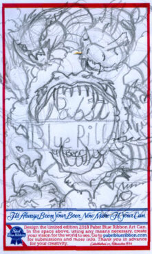
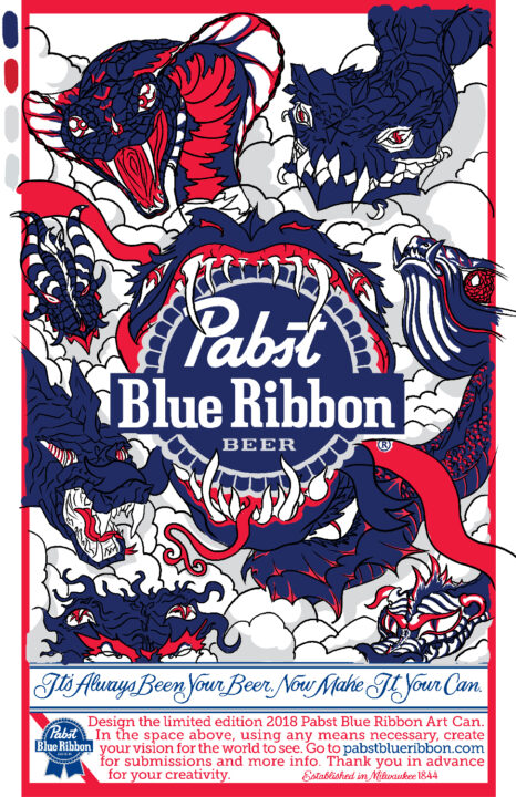
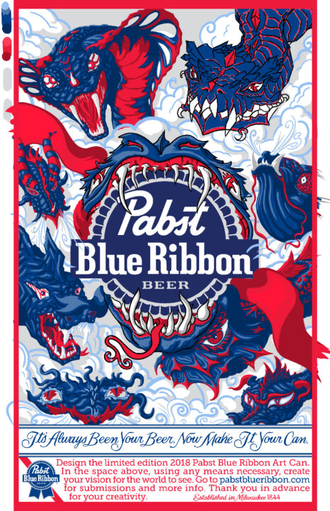
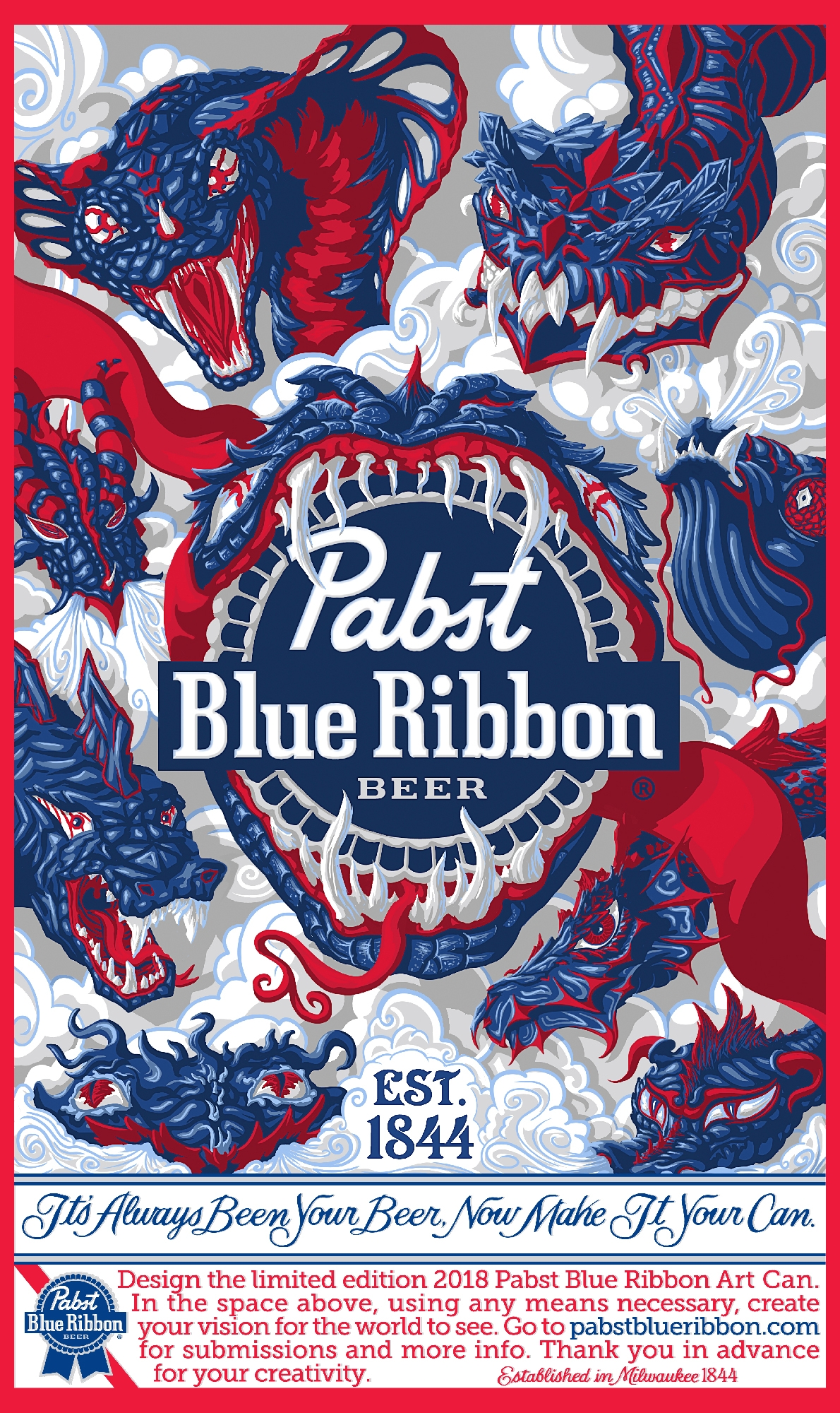
As a creative individual, I am often reminded how much more successful our work is, when it’s based on something we love. So I opted to follow my passions a create a can based on the mythological Hydra. But, in this case, I used 9 different head designs to help add visual interest and play into the many flavors that go into the taste of beer. After all, I wanted to have as much fun with this as possible. Then I considered the audience and the size of the final product.? Framing the dark heads in light clouds would help to give the viewer areas of interest as well as spaces to rest their eyes. So I have my roughs, my lines and my colors all directed towards the final viewing mode, can art.
Getting to the Final
After blocking in and zooming out to review the design, I realized that my competition art was far to dark and flat. This is a competition piece and it has to stand out against all the other fantastic entries. And not because it’s so bad! So, I added more variation to the clouds, adding dark portions to reduce the impact of white against dark blue. More layers of light were then places onto all the colored portions, bringing them up a few notches to meet with the cloud values in the background. It also made sense to remove the black lines to give the whole piece more flow.
The Last Review of my Competition Art
I then took the piece to my review team who was having a difficult time discerning a few hydra heads. Since I wanted to stick with the brand colors, the blue ribbons blended into the hydra heads, causing a bit of a visual mess. So I removed the two blue ribbons and scaled back those heads a bit. This allowed more space for the centerpiece, but also more breathing room for the viewer.
I, finally added some speculative highlights and texture to all the creatures and cleaned up my edges. I re-painted the logo to fit in more with my drawings, to help with harmony as well. The final results came out fantastic, just like I planned. The range of heads adds a variety of emotional responses, but the design itself is eye catching at a distance. Anyone who is drinking some PBR, is then drawn to pick up the can with some intense creatures on it. They are drawn into the piece, exploring deeper into my designs as they enjoy their beverage.
“What head do you like the best?” Is the argument I want to hear at picnics next summer.
