Christopher Daring Cover 1
Creating the illustration of Christopher Daring Cover 1: Spirits of the Dead for author Stephen Willis was a great experience. And with the book and new designs now available Spirits of the Dead: A Supernatural Adventure (The Christopher Daring Adventures Book 1), it’s the perfect time to share some insights into its creation. Don’t Forget to check out the bundle for book 1 and 2 as well.
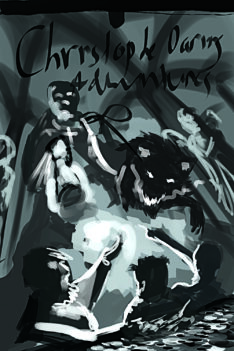
It was easy to see that Christopher Daring Cover 1 was to be the piece that sucked his audience in. I knew his characters had to be introduced. But, at the same time I had to make sure it was dramatic enough to get that audience response. So, I went with a low angle, placing us with the children as they dug into a tomb filled with treasure. That’s exciting, right? But, to make it really dramatic, we added the towering antagonist and his terrorizing hell hound overshadowing all the heroes. We then placed the whole scene in an underground tomb which I refined in my line drawing.
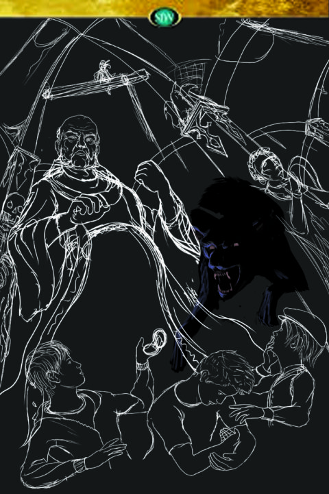
Beginning the Painting
So we took the line drawing and rough values then proceeded to execute on the idea. Christopher daring cover 1 had its frame, but now it needed some magic. And what is magic, if not a brilliant display of color and light? So, I chose a warm cool combination. It would help to emphasize the safety where the heroes are, and the dark/dead feeling that backs the villains.
The piece at this point looked alright, but was becoming too dark, losing all hope of drawing in those eyes. I couldn’t push the center warm light too much, or I would lose the weaving of dark and light areas. So I moved onto including some natural lighting elements, mainly atmospheric light from the cool misty catacomb.
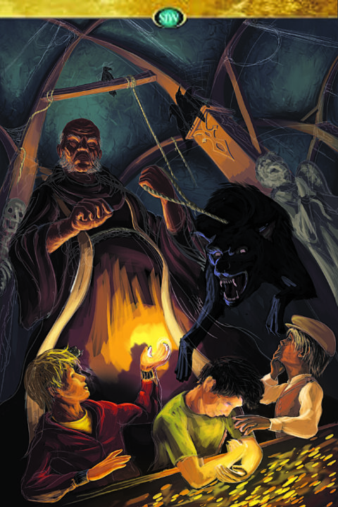
Refining the Painting
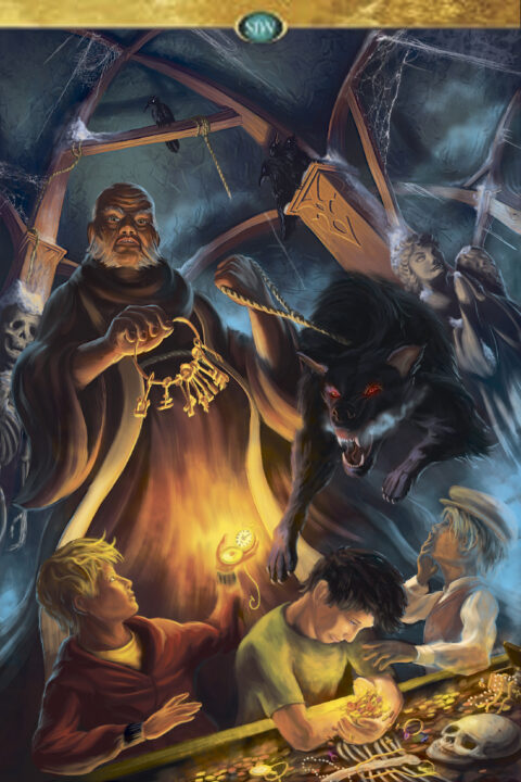
This is probably my favorite stage of creating book cover art, playing with light and color. In order to make a piece work, all of it has to harmonize within the scene. I started off by adding in the very cool mist that would frame all the characters. This also helped to separate the background and add dimension and depth. Additionally, I bounced the warm lights around, harmonizing each section with whatever was next to it. Light bounces all over the place, so finding interesting and fun ways to incorporate that can be extremely fun while painting. As you can see with this one, their were tons of places to use the blues against warms to add interesting contrasting colors.
The Final
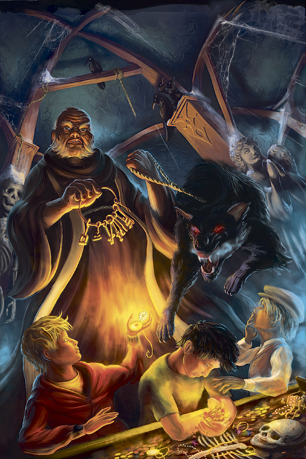
After discovering my lights and how they would all interact, it was only a matter of refining and emphasizing what we need to make this piece stand out. Christopher Daring Cover 1: spirits of the Dead was coming to a close and It was time to pull everything together.
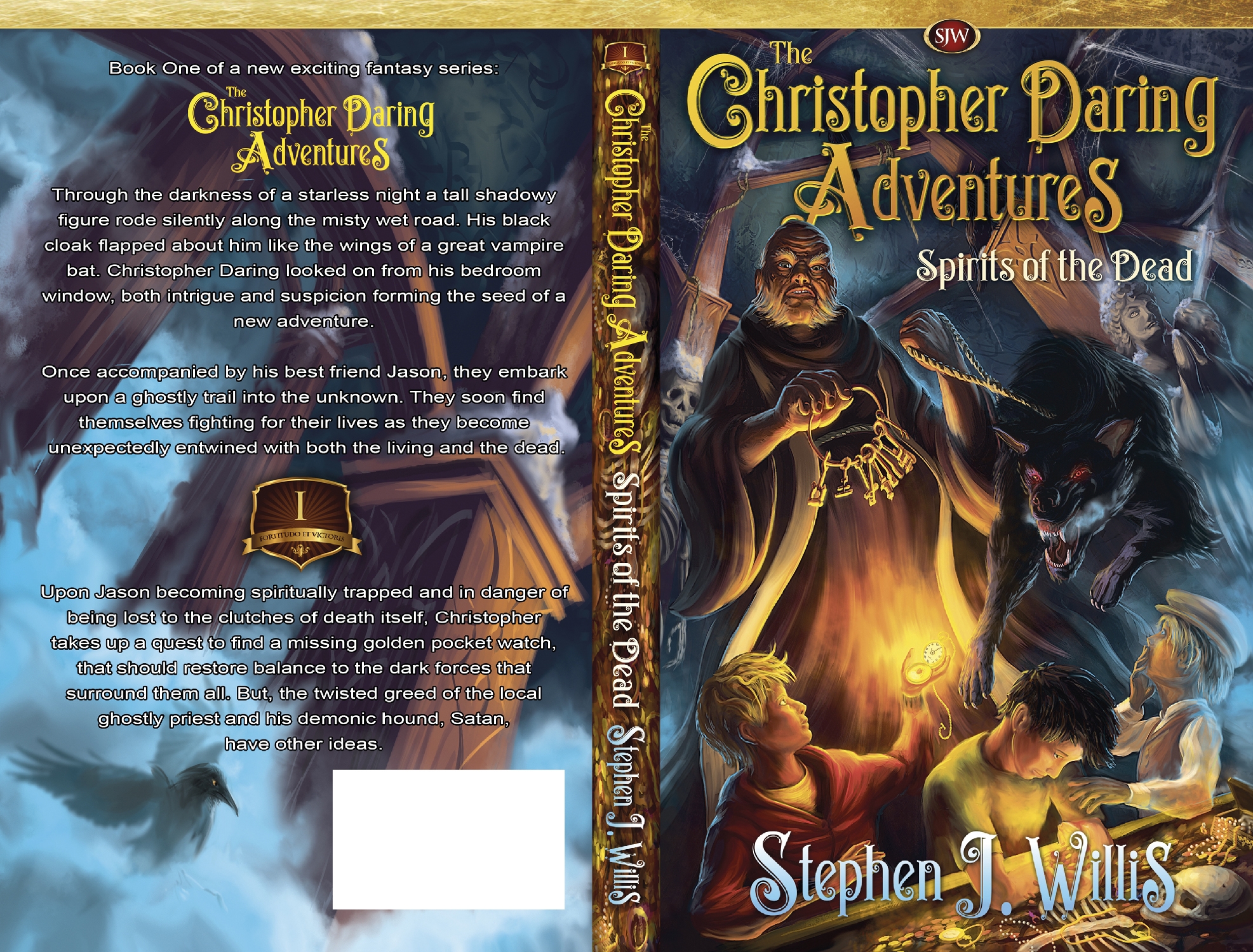
I used the bounce light to make the entire scene a bit more colorful and bright. I then selectively darkened specific areas of the piece (the hell hound and dark priest) to pull them out and over our unsuspecting heroes. Also, I added a very distorted view of the catacombs on the back. This adds further distress the viewers sense of safety and stability. I worked out a graphic design that was simple enough to read, with a bit of flare to help ease people into this dramatic scene. After all, dark evils aren’t so scary when you know theirs magic around. And here is the wonderful illustration of a dark priest and his hell hound stumbling onto our heroes, who have just uncovered his disgusting scheme.
If you enjoy this cover and would like to have a copy for your home feel free to pick up a print at my shop. And don’t forget to head on over to Amazon and grab your copy. Have a great day.
