Fantasy Cover Tutorial – RIM # 3 – The Protectors
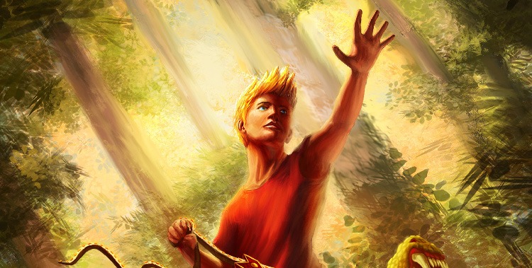
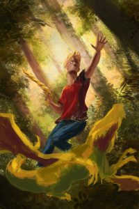
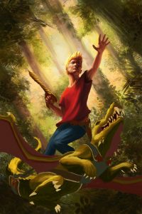
For today’s fantasy book cover tutorial we will be reviewing the creation of the “Croco-Dragon” illustration for The Royal Institute of Magic #3 The Protectors by Victor Kloss. (Click to purchase his books through my affiliate link and help support two creators at once).
The first step for any illustration is to get as much information and resources from the author or art director as possible. Because this was my third cover with Victor, I was able to skip the general description of the character. However,? I still needed to get a grasp on the story and this scene in particular. This one was rather simple, Ben (our main character) is riding a strange crocodile type dragon through the forest that “the protectors” utilize for their home. And so we begin…
Initial Concepts – Fantasy Cover Comparison
Now, because this was a somewhat basic scene, I knew that I had to do what I could to make it energetic and interesting for the viewer, and my favorite way of adding action to a scene is all about the angles. For this tutorial on fantasy book covers, and all others, remember to compare against the competition. So my first thought was to tilt the horizon line, adding a bit of uncertainty to the ground level. Then my second thought was to further push this energy by painting the character from a low angle, almost like he is about to fly over our heads. So I blocked in a very rough thumbnail to illustrate my ideas to the Author.
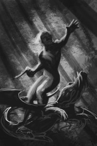
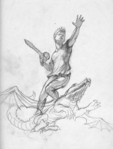
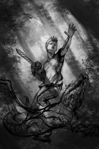
The concept was approved! (Gotta love that feeling) Of course, it was now time to make the image work. The first thing I needed to do was shrink the characters down a bit to allow a bit more room for the title. (something you must take into consideration for cover work, be sure to get the details from the creator/director) Then because the character is essential to this piece, I wanted to do a pencil drawing, getting him as close as possible to what I need. (see on left). After that I wanted to develop the values and background a bit more, so I would know my light sources and overall look.
Refining the basics
At this point we had all the roughs set in place, except the color. So I began to splash a bit of color into the image. I originally liked the basic “green” forest, however it did not inspire the right kind of feelings, which is very important to grab the right viewers quickly. So we tweaked it just a bit to envelop the scene in a warmer light. I then choose a strong contrasting color set for our characters to really pull him from the background.
With our drawing, values and color now in place, it was time to progress the painting. At this point I bounce back and forth between all the areas of the painting, developing and unifying the piece. The colors and light needed to harmonize or we would be left with what looks like a cookie cutting placed on a background. In addition, I make sure that the background elements line up properly with the foreground. By this, I mean, making sure light areas have a darker backgrounds to frame them or vice versa. Then I paint, paint and paint….. zooming in more and more at every pass.
Polishing the Details
After making several passes around the entire piece, paying attention to the cohesiveness of my image, I begin to add some final details. First I start cleaning up and sharpening the work, eliminating any rough bits around the piece. I also step back from the entire work to get a feel for the instant reaction it gives. At this point I think more in terms of simple light and color than anything else. Light splashes, it bounces and it alters they way everything looks, and you want to try and capture that, if you really want those moods to pop into the viewers mind. So I splash the warm lights around, bounce the greens and pull the forest and sky into our character.
And there you have it, The Royal Institute of Magic #3, The Protectors tutorial fantasy book cover! I hope you enjoyed the insight into my procedure and design practices. If you like the piece or want to support the artist, the Croco-Dragon Print is available, just click the link. Keep on Creating!

